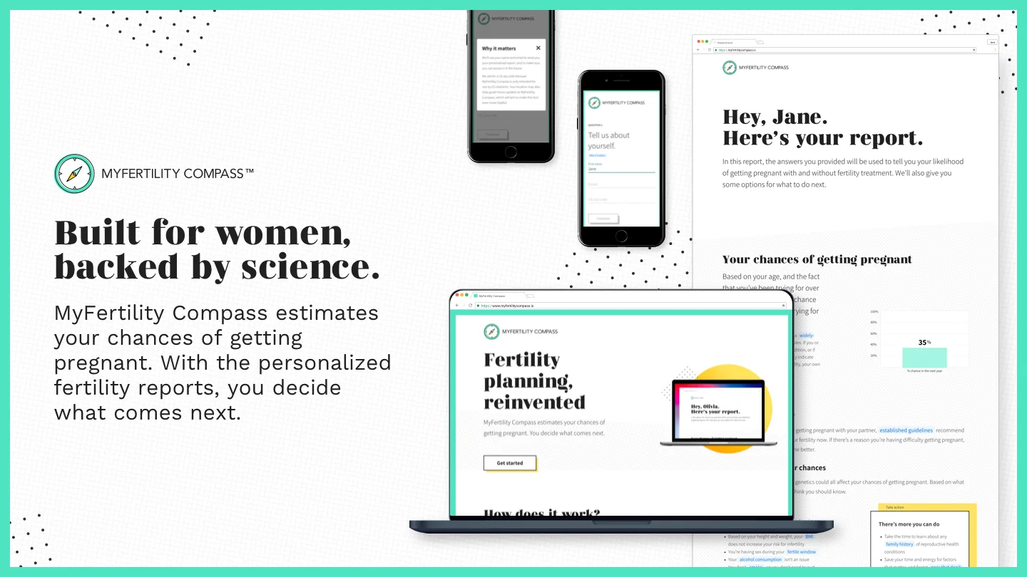
myfertility compass
MyFertility Compass is a free, online tool that helps women understand their likelihood of getting pregnant backed by science and through that, empower women to make proactive decisions.
Problem
Women often times do not realize that family planning isn’t an instant switch from not trying to conceive for many years and then being able to conceive right away. And for the majority of women, who require a little more time to conceive, that can lead to a lot of worry and unanswered questions.
Role
I coordinated and led all facets of design including: interaction, ux design, visual design & branding, wireframe, mocks, design-dev hand-off, and QA testing.
Nina Passero - User research
Mark Ferguson - Content copywriter
Karen Cohn - Scientific communications
Design approach
For this design process, we will be focusing on the questionnaire and report design as those were the most complex in regards to this project. A separate case study will include branding and landing page designs.
Design Process:
Conduct user research/surveys to better understand our user personas
Identify our competitors and conduct market research to analyze what they include in their tools and how they educate and empower women
Wireframe, test, and mock questionnaire and report layout to make sure it meets user needs
Research analysis
User research/survey
Since the questionnaire content is already determined based on scientific research, the largest part of the project is to understand what the voice and content would be for the report, and who our users are. Some large questions we set out to answer during user research were:
How much do women actually know about their reproductive health
How many women talk to their partners, friends, family, and physicians about their fertility, egg freezing, pregnancy, miscarriage, fertility treatment
Who or where are women going to for information about these topic
Based on user interviews and surveys we concluded that:
Women learn about fertility through the internet, where it is saturated with misinformation
There is a need for fertility education
There is stigma and fear around fertility
Physicians and patients need to be more proactive about conversations
Women need to keep an open dialogue with loved ones
Through our research, we determined that our user base are women in their early 20s to mid 40s within these categories:
starting their family planning journey who may be having trouble conceiving
starting their family planning journey who may not be having trouble conceiving
have not started and are not planning to anytime soon

Competitive analysis/Market Research
Due to the rise of fertility and menstrual apps and sites, we decided to do some market research popular downloads and usage. The Clue App, Flo, and AssessYourRisk gave us great insight on things that we should include in our online tool. These are our findings from user research and market research:
Start off with basic information and as users progress, more complex, detailed questions and information can be shown.
Empowering and uplifting language
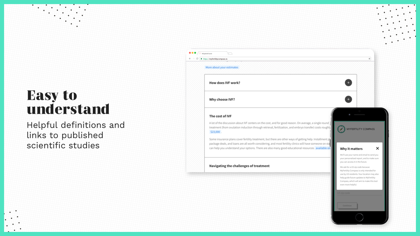
Include helpful definitions and links to published scientific studies
Include personalized results and give users actionable steps to proceed
Design visual cues and simple layout that is easy to follow

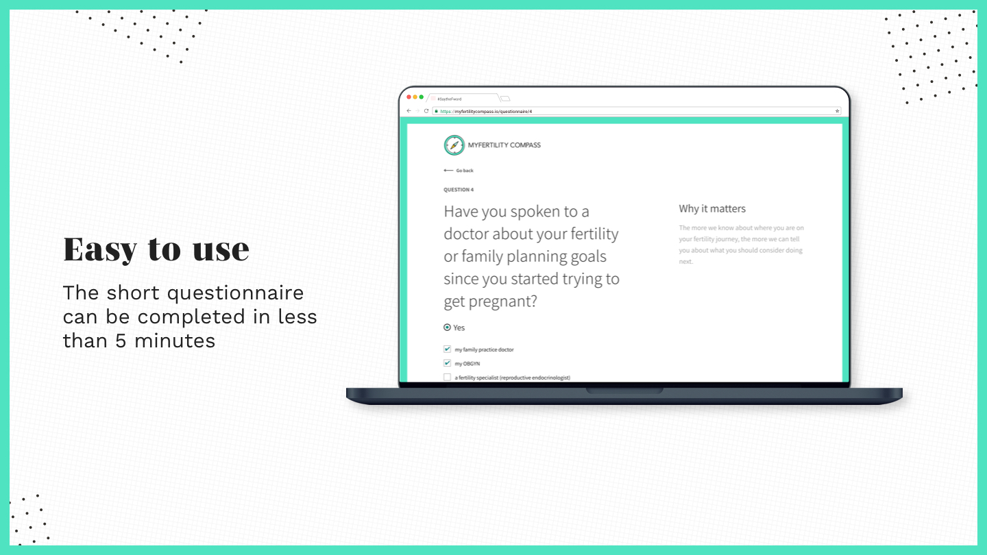
Questionnaire design
Wireframe iterations
Gathering the research analysis and understanding what we needed in the questionnaire pages, we started to wireframe our ideas. Working closely with the scientific communication team and the brand strategist, we worked out what questions we wanted to show, the correct order of the questions, and which questions contained conditionals. With that in mind, for the wireframes for the questionnaire, I focused on:
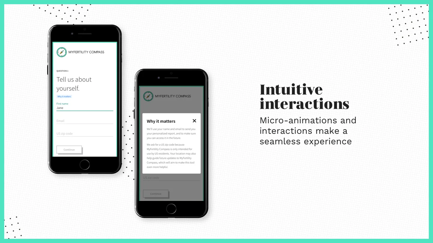
How to show “why it matters”(section explains how it impacts family planning) on mobile vs desktop during questionnaire
Designing an easy scannable layout
Wireframming specific question types (radio buttons, fill-ins, and check list)
How to show conditional questions
Different layouts and concepts were tested to see which worked best for conditional questions and “why it matters” section.
card styles can be fun and interactive however due to high volume of questions, can get repetitious and long
with conditional questions, you would essentially end up with a scrolling card inside a scrolling page or even more cards if they show up in a new card.

Final Wireframe
We ended up going with option 1 with the simple two column layout for desktop which is easy to read, familiar, and easy to implement. With the card layout, conditional questions will make the card layout more complicated and feel longer.
In terms of the “why it matters” section for mobile, we ended up with option 3. There were concerns about option 1 based on pinned bottom tab, where users would not understand that new information is loaded every time a new question appears. The high-lighted button treatment, fit with the user flow where usually someone would want to know more about the question after reading the question.

Final Questionnaire design
Mock - Final design
Finalizing on the wireframes, our goal for the Hi-fi design was to incorporate and develop the UI design and to implement the visual hierarchy of the page. During this time, I was also in charge of coming up with the branding and developing a UI kit for MyFertility Compass. With that in mind, some of these designs were being pulled in from the branding iterations. For the Hi-fi mock, I focused on:
Designing button styles, question field design and interactions
showing active and non-active states animations/interactions
showing visual hierarchy through typography and color usage
Incorporating brand colors onto the elements


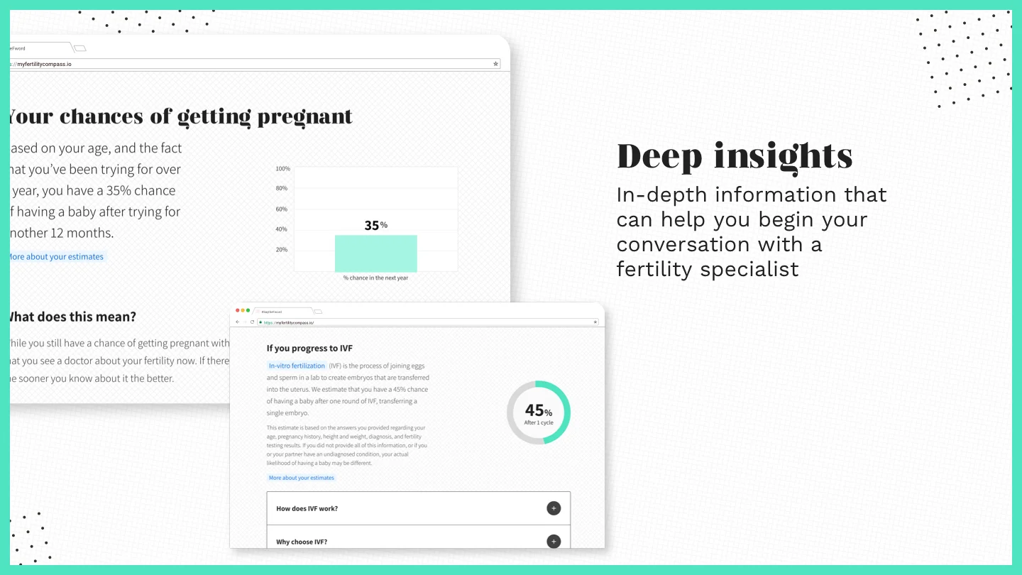
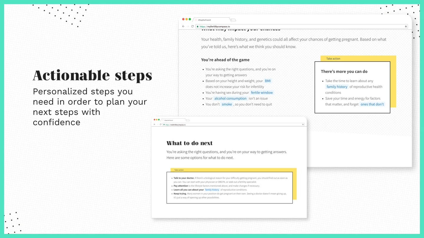
Report design
Wireframe iterations
By finalizing on the required sections and content of the report, we were able to start the design process. The focus of the wireframe designs and content include:
Quick & scannable layout
Make section topics stand out on it’s on
Storytell based on user flow from basic to more complex information based on users’ input
Have actionable items for users and make it stand out
Shatter stigma and fear around fertility
Show personalized results
Define glossary terms when needed and provide sources to distill misinformation
Report Wireframe user feedback
Too many containers and hidden content. Not scannable.
Sections such as “What does this mean” and “if you see a doctor” do not contain information that needs drop-downs
Sections such as the “treatment” and “IVF” section would need drop-downs for FAQ styled information
Closest to what is needed
Solves some issues that were presented in the “Contained - Dropdown” concept
Sections are not separated properly even though some sections relate to one another

Glossary Wireframe - User feedback
During the same time that I was iterating on how the “Why it matters” section looked during the questionnaire page, and the overall report design, I was also iterating on how to show glossary terms. Some of these options were: drawer sliding containers, “tool-tip” style overlaying content, and drop-downs, and high-lighted link overlays.
We ended up choosing the high-lighted link overlays due to how recognizable it is for users, and because it worked well on mobile for both report and questionnaire.

Final Wireframe
Based on previous user feedback:
Made different sections more prominent
Used drop-down only on appropriate sections where content can act like FAQs
Call actionable steps out more


Final report design
Final report design
After finalizing on the wireframe and user testing, our focus for the hi-fi mocks were to:
Create a visual system to show how different topic sections would be called out
Design visual cues to break up content making it easy to read
Incorporate consistent style to indicate sections with actionable steps
Define typographic scale styling and layout spacing
Because the visual design was already set during branding sprints, there were no major feedbacks when I started incorporating the designs into the finalized wireframes.


final flow
You can check out the final user task flow below.

Stat metrics
Our first month goal was to have 300 reports generated. However, we reached our goal during the first day of launch.
8,000+ reports generated since then with 55,000+ unique sessions and 37,000+ unique vistors
22% conversion rate for report generation from landing page
Next steps
Gather more user feedback
Due to time constraint, we were only able to user test the branding, content, and the report layout and design
Would like to gather more input on functionality of the questionnaire and improvements on landing page
Improve on typographic scale and visual hierarchy of questionnaire and report design
Incorporate PDF functionality so women can choose to print out the report to bring to their physicians rather than taking screenshots.